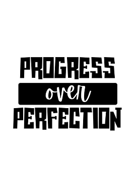
Select product type
Choose size
Add frame
Legal Disclaimer
This Displate was created by an independent artist. It may feature trademarks, designs, copyright-protected works, images of public figures or other rights. Unless expressly stated otherwise, the respective rights owners have not consented to the offer and sale of the Displate.
Explore more posters
Displates in your awesome spaces
See all inspirationsOfficial metal posters
from 200+ fandoms

Join our newsletter for the latest discounts and Displate goodies
By clicking “Sign up”, you agree to receiving emails and to processing of your personal data in accordance with the Privacy policy. The data will be processed to customize the newsletter content according to your personal preferences. The controller of your personal data is Displate, i.e. GWD Concept Sp. z o. o. with a registered office in Warsaw. You can unsubscribe at any time by clicking the “Unsubscribe” button in the email footer, unchecking your consent in the “Basic Info” tab of the customer panel, or sending a request to support@displate.com.


